Academic research & writing platform
The system connected the evidence.
The experience made that trail hard to follow.
I followed one Snippet, the platform's unit of captured evidence, from its source through capture, routing and reuse to see where that trail became difficult to understand. I mapped the system behaviour behind those breaks, decided which parts of that logic researchers needed to see at each stage, and redesigned the workflow without changing the underlying evidence model.


Project Snapshot
Improve learnability and onboarding for first-time users
3-month commissioned study followed by a 2-month independent investigation
Students, academic staff and others producing evidence-based written work
The underlying Snippet model and Page structures couldn't be substantially changed.
Moderated usability testing with 11 first-time users, thematic analysis, heuristic evaluation and system testing.
My Role
About the platform
The Business Reality
Average session duration
<15 mins
Average active time per session
4 mins
Figures provided by the product team.
The initial plan assumed the issue was limited to onboarding and proposed a surface level fix followed by a visual interface refresh. However before designing isolated onboarding screens I pushed to evaluate the end to end workflow. I structured the usability sessions around goal-oriented tasks to see where user momentum truly stalled.
What happened when we tested the core workflow
To test that assumption we ran moderated usability sessions with 11 first-time users. These participants were university academics and students whose primary goal was to capture, organise and synthesise information directly into their writing. We observed them working through a realistic research scenario that moved from capturing evidence while reading to bringing it into a draft. Their progress revealed a clear break between Capture and reuse.
9 / 11
Managed to complete Capture
2 / 11
Progressed to importing evidence into writing
Existing Capture flow showing where uncertainty begins after the Snippet is created.
— Participant 06
— Participant 11
These were not isolated interface questions. Participants were struggling to carry an understanding of their evidence forward through the workflow. 9 participants never opened the right-hand sidebar, where captured evidence is used in writing. Phase 1 addressed that, so the 2 in 11 figure shows that reuse was breaking down. It does not show that Import or Page relationships caused it.
The study also had a limit. Because most participants stalled before the later stages, Import and Page-relationship behaviour was not meaningfully tested. I knew where understanding was breaking, but not yet why the system behaved that way.
Investigating the system before changing the behaviour
To understand why the system behaved this way, I needed to look beyond the interface. I mapped what happened to a Snippet from the exact moment it was captured, all the way to the point where it could be reused in writing.
Two objects were central to that workflow. A Snippet was a reusable piece of evidence captured from a source and kept linked to where it came from. A Page could be used to organise that evidence or as a place to write. The same Snippet could be associated with more than one Page, allowing evidence captured in one context to be reused elsewhere.

The map clarified an important distinction. Capture worked at the level of an individual Snippet, while reuse could happen at the level of a Page containing multiple Snippets. A Snippet was saved first, could optionally be associated with another Page, and later become available for writing when evidence from that Page was imported.
Three distinct moments of friction
While the platform was designed around a seamless research-to-writing loop, tracing the evidence showed that friction was breaking the journey across three key moments:
01
Capture
Save evidence without interrupting the reading flow.
02
Route
Find the right destination for a Snippet as the workspace grows.
03
Organise
Understand how Snippets and Pages are connected.
These were not three isolated interface problems. They were connected by the same underlying Snippet and Page model, so changing one part of the workflow could affect what happened later.
01/03
Capture without interruption
When a user selected evidence and pressed Capture, the Snippet was already created and associated with the current Page. The popover that followed was therefore not required to complete Capture. It gave the user additional options to edit the Snippet or associate it with another Page.
The interface however did not communicate that state clearly. The design appeared to assume that researchers should organise evidence immediately while their memory was fresh or it simply lacked a better local control to assign a snippet to a page. Because the routing field received immediate attention there was little visible confirmation that the original capture task had already succeeded. As a result saving evidence and deciding where else it should belong could feel like one continuous requirement.


— Participant 04
For someone reading and collecting evidence, the immediate task was much simpler: I found something useful. Don’t let me lose it. The interface was introducing an organisational decision before making that first task feel complete.
That was the obvious direction at first. If Page assignment was interrupting Capture, removing it would make the interaction considerably simpler.
But the system map showed why that decision was not so straightforward. Associating a Snippet with another Page was one of the ways evidence could be organised for later reuse. It also happened at a useful moment, while the source and meaning of that evidence were still fresh in the user’s mind.
So there were two legitimate needs competing for the same moment.
Capture should be quick enough that users can preserve evidence and continue.
The platform still benefits from giving users an opportunity to organise that evidence while its context is fresh.
The problem was therefore no longer whether routing should exist. It was how much attention routing should demand during Capture.
This became the principle I used to evaluate the interaction rather than starting with a preferred UI.
For a researcher deep in a reading session every interface decision steals focus away from the actual text. To resolve the tension between quick capture and optional routing I had to design for the user's cognitive limits.
Instead of starting with UI elements I defined exactly what the researcher must perceive and know during this interaction. Before exploring alternatives I set four cognitive criteria for the Capture experience

Users should know Capture is complete before deciding what happens next.
Saving evidence should not require another decision.
Users who know where evidence belongs can route it while context is fresh.
Notes and routing remain available without appearing required.
With those criteria in place, I explored how much the Capture surface should ask users to do after the Snippet had already been saved.

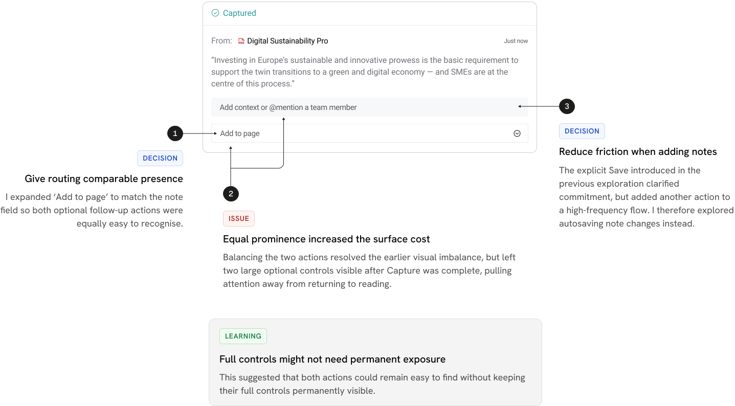

The first three explorations changed what the popover contained, but they all retained the same assumption, that Capture should open one. I tested a different model to see whether success could be confirmed without interrupting the reading flow, while keeping organisation available when needed.
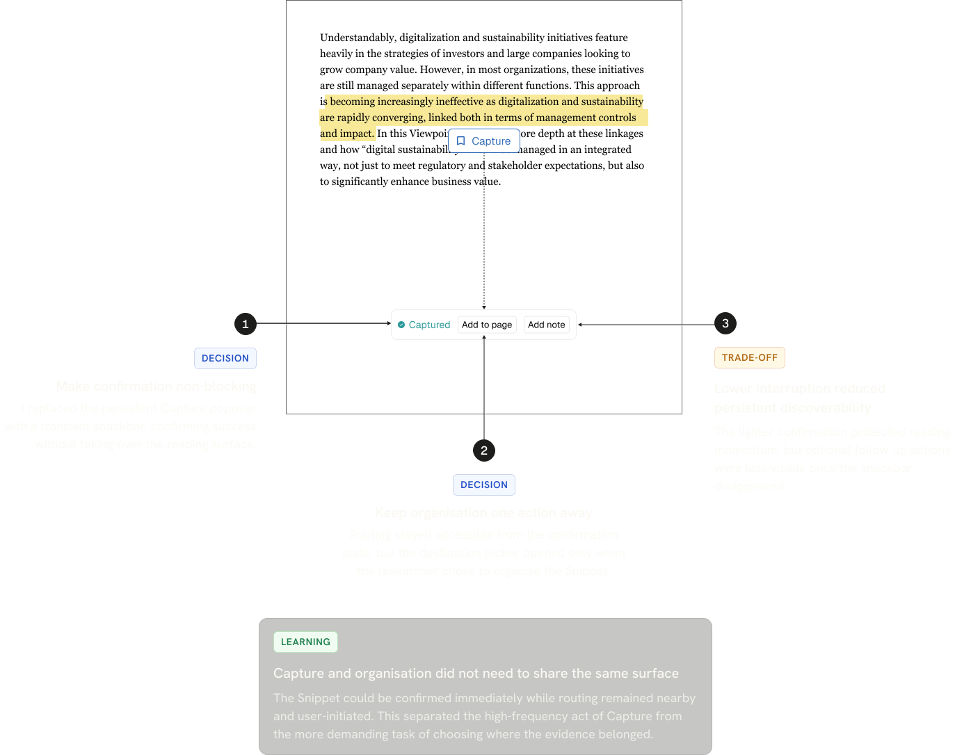
02/03
Route to the right destination
Separating routing from Capture made “Add to page” a deliberate action rather than part of completing Capture. I then examined the destination picker itself to understand what happened when someone actually chose to organise a Snippet.

How I first approached retrieval
I started by asking how the way someone finds a destination might change based on their current research goal and their memory of the workspace. From this I formed a working model.
If the user is actively building structure and remembers the Page name or author, Search offers the quickest route
If the exact destination is unclear but the topic or source context is known, surfacing likely options helps the user recognise the right Page.
If the user does not have a specific destination in mind they need to browse the surrounding context and progressively locate or create a home for the evidence.
I used this as a working model to guide the first explorations.
If the first model depended on recall, I needed to understand what someone might actually remember when trying to relocate a Page. I mapped every cue the platform could potentially use, from Page names and source details to citation metadata and content inside files.
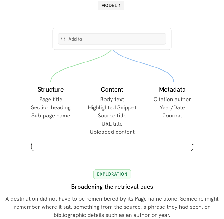
Mapping the cues showed how much information the platform could potentially use for retrieval. But the destination picker had a much narrower job, i.e. help someone choose a Page to route the Snippet to.

This kept Search focused. A Page could still be found from an incomplete title or remembered source information, without turning a small routing interaction into a search across every heading, paragraph, Snippet and uploaded document.
Citation metadata was the less straightforward case. A user might remember a source through an author, year or journal rather than its title. If those details identified a selectable source Page, they could still be useful for destination Search.
I initially explored whether citation should therefore become a separate search mode.

Looking at the interaction more closely I realised the problem went deeper than partial recall. It exposed a core design tension between source and meaning. I had assumed that citation information could help identify the Page the user wanted to route to but that assumption did not always hold.
A citation simply identifies where the evidence originated but it does not necessarily define what that evidence means in the researcher's current workspace.

But consider a thematic Page such as 'Digital Sustainability' that contains evidence captured from Chen 2023.
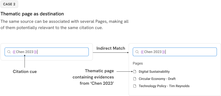
Here, Chen 2023 does not identify the destination Page. It identifies the source.
To return those thematic Pages, Search would have to move beyond matching the destination itself and follow:
source → evidence → Pages using that evidence
Because evidence from the same source could appear across several Pages, one citation cue could legitimately relate to multiple destinations. I could no longer assume that citation metadata uniquely identified the Page.
The exploration also challenged my first recall model. A partial title, author or year could still be enough to Search, so I stopped treating Search, Suggested and All Location as fixed levels of memory.

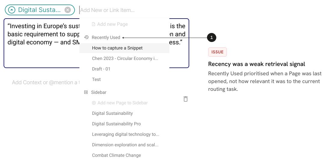
Search worked when someone had something useful to type. The existing picker also surfaced Recently Used Pages as a recognition aid, but recency was not a reliable proxy for relevance to the evidence being captured.
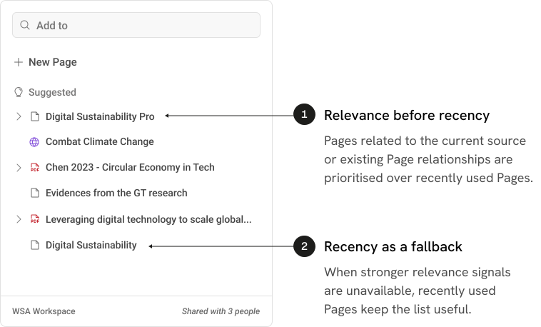
I explored using signals such as the current source and existing Page relationships to surface more relevant destinations first, with recency used when stronger contextual signals were unavailable.
All Location
Suggested could surface likely destinations, but users still needed a way to reach any Page in the workspace.
Earlier in the case study, I had already identified that the existing hierarchy became harder to navigate as nesting increased. At this point, I brought that problem back into focus before exploring alternatives.
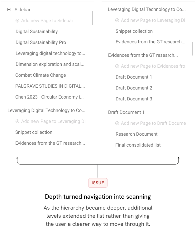
How could I make a deep hierarchy easier to navigate without removing the flexibility users already had?
The Structural Constraint
The platform can contain deeply nested Pages, but the sidebar does not provide persistent visibility of Sub Pages created within documents. The destination picker therefore had to carry the structural complexity of the workspace within a small, temporary surface.
Applying stress cases to the hierarchy
Key paths gave us the normal routing journeys but I needed to ensure the interaction model held up under difficult conditions. I defined specific stress cases such as workspaces where hundreds of Pages exist across deeply nested structures. I explored several ways to make these deep structures easier to navigate and then pushed each approach against these stress cases to see where it broke.
01–02 · Making the hierarchy clearer

I first focused on making parent and child relationships easier to read while keeping more of the structure visible. However, showing more of the hierarchy improved context, but deeper structures still increased scanning and visual density.
03–04 · Containing the hierarchy

Next, I explored containing the structure through scrolling and more controlled navigation rather than allowing the list to keep expanding. Containing the hierarchy reduced its physical footprint, but shifted the effort into scrolling and keeping track of where the user was.
05–06 · Giving the hierarchy more room

I then tested whether additional width (5) and clearer separation between levels (6) would make deeper structures easier to traverse. More space improved legibility, but it did not remove the underlying problem. As depth increased, too much of the hierarchy still had to remain visible at once.
The Breakthrough: Navigate the Hierarchy on Demand
The explorations showed that the problem could not be solved by giving the hierarchy more space. Whether it scrolled vertically, expanded horizontally, or occupied a separate tab, deeper nesting still required users to navigate through structure they did not need to see.
The solution was to change how the hierarchy is revealed. Instead of expanding the entire tree inside the picker, I introduced contextual re-rooting. Selecting a Page or branch moves the researcher into that local context, temporarily replacing the broader hierarchy with only the destinations relevant to that branch.
A persistent breadcrumb keeps the user's position visible and provides a clear path back to the parent level.
Try it!
A small detail with an important role:
Showing where a Snippet is already linked gives researchers confidence before adding another destination, and is intended to reduce accidental duplicate routing without interrupting the capture flow.
Final direction
Rather than simplifying the Page structure itself, I reduced how much of that complexity users had to deal with at each moment. The same picker could now support direct retrieval, recognition and deep structural navigation without forcing users into one method.
03/03 Organise and reuse
Routing solved where evidence could go. Reuse exposed what happened next.
Routing made choosing a destination more deliberate. Reuse introduced a different problem: once evidence reached a Page, Page relationships could make that same evidence available elsewhere. I reproduced those behaviours to understand what a researcher was actually seeing when they returned to their evidence in the writing sidebar.
The researcher puts a Snippet on a Page, at Capture or later through “Add to page”.
A Page sits under another Page, and its Snippets also appear on the parent. Nesting has no limit, so a Snippet can travel up through several levels.
A Page brings in another Page's Snippets, including those that Page already holds through its own Sub Pages and Imports. The Import stays connected, so it changes when that Page changes.
A link on its own connects two Pages without moving any Snippets.
The study could not tell me whether these differences mattered to researchers. Most participants stalled before Import, so I knew where understanding broke but not why. My earlier map had treated Import as a single step, when it was the visible result of several Page relationships behaving differently.
The sidebar exposed these relationships, but made them difficult to interpret
The platform did record why a Snippet was available on a Page. In the right-hand sidebar, that information appeared through headings, Page chips, arrows and indented paths. Each followed a different visual convention, while Source information sat alongside them. The study never meaningfully reached this screen, so this was my reading of the product rather than an observed usability finding.

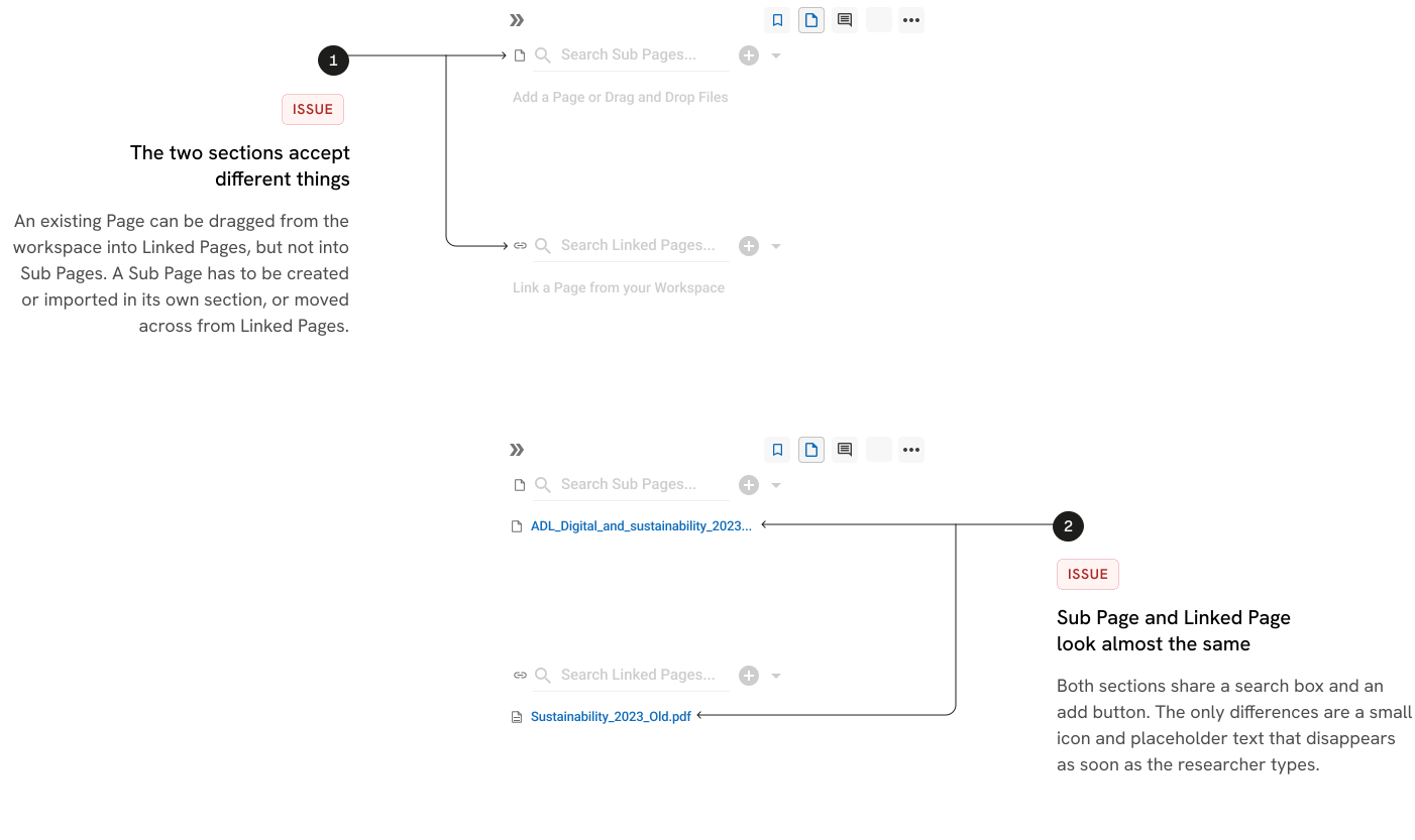

The Source was already visible on every Snippet card, and the relationship path was shown too. The difficulty was reading it. The marks were small, each followed a different convention, and Source and relationship information could appear visually connected even though they answered different questions.
The study showed the break, but not what happened beyond it
Most participants stalled before they meaningfully reached Import and the later Page relationships. That told me the research-to-writing journey was breaking down, but it did not tell me how users would understand Sub Pages, Linked Pages or Imports once they encountered them.
I could not treat those later behaviours as usability findings. But setting them aside would leave the product’s core reuse model unexplored.
I needed a stronger basis for designing the later-stage experience
I therefore combined two sources of evidence: how the platform actually behaved, and what published research and established product patterns suggested about how people organise, revisit and reuse evidence over time.
This gave me a basis for forming design hypotheses without presenting assumptions as participant findings.

The combined evidence suggested that the experience needed to support changing research goals, reuse and reorganisation while keeping provenance and the consequences of system behaviour understandable.
The gap was between what an action appeared to mean and what the platform actually did
I compared the system rules I had reproduced with the expectations users could reasonably bring from familiar document, collection and linking patterns. These expectations were inferred rather than observed, so I treated the differences as design risks to investigate, not proven usability failures.

The parent contains its own material, while the child provides structure beneath it.
Evidence available on the Sub Page can also become available on the parent.

A connection or shortcut to another Page without sharing its contents.
A Linked Page connects the Pages but does not automatically transfer evidence.

Bring what is currently on another Page into this one.
The imported Page’s available evidence becomes available here, including evidence coming through its own relationships, and the connection remains live.

Removing a relationship removes what that relationship brought.
A Snippet can remain available when another valid relationship still brings it.
These expectations were inferred from familiar patterns and were not observed in the usability study.
Several of these relationships did more than organise evidence. They could change what became available beyond the current Page, continue updating over time, or leave a Snippet available through another route. The interface gave little help in understanding those consequences before committing to an action.
Seen together, the mismatches formed a lifecycle. Researchers first needed to find the relationship that matched their intention, predict what it would change, later understand why evidence was available, and finally know what would happen if that relationship changed.
Twenty gaps reduced to four questions
Can I find the relationship that matches what I am trying to do?
Relationship controls were weakly labelled
Import was hidden behind another action
Sub Pages and Linked Pages were visually difficult to distinguish
Similar-looking relationships produced different outcomes
Before I act, can I tell what will happen to my evidence?
Sub Page evidence could become available on its parent
Import could include evidence arriving through deeper relationships
Import remained live and could change later
Linked Pages transferred no Snippets
Consequences were difficult to understand before committing
Once evidence appears, can I understand why it is here?
Direct and relationship-driven evidence could look similar
Routes could extend through several Pages
The same Snippet could remain available for more than one reason
Source information and relationship information were easy to conflate
If I change the relationship, can I tell what will leave and what will remain?
Removing one route might not remove the Snippet
Another valid relationship could still keep it available
A Page-level change could affect other Pages
The relationship responsible for the evidence could live elsewhere
I decided what the interface needed to explain
The relationship model could become deep and overlapping, but exposing the whole network would simply transfer that complexity to the user. I separated the moments when that complexity actually mattered: before a consequential action, the interface needed to explain what would change; after evidence appeared, it needed to explain why it was there. Deeper relationship detail could remain available on request.
Source should answer where the evidence originated. Relationship information should answer why it is available here.
I stress-tested that principle before choosing a layout
Before deciding how the sidebar should be structured, I tested the interaction model against difficult relationship states. I wanted to know whether the rules still held when evidence arrived through deeper chains, several routes existed at once, or a relationship changed later.
Empty Page →

Broke
Nothing showed that relationship options existed.
Deep Import

Partly Held
Explaining the full relationship chain became too complex.
Live Import changes →
Partly Held
The model explained that the relationship was live, but not that something had changed.
Page used elsewhere

Broke
A local action could affect another Page without making that consequence visible.
The scenarios showed where the model needed stronger rules before I committed to a layout. Relationships had to remain discoverable even when nothing had been added, deeper chains needed progressive explanation, and actions that could affect evidence elsewhere needed their consequences surfaced.
I compared three ways to structure the sidebar
The stress tests clarified what the interface needed to explain, but not how that information should be organised. I explored three structural directions and compared them against the gaps that had proved most consequential.

The relationship and the evidence it contributes stay together, making added directly and brought-in evidence easier to tell apart.
A Page with many relationships makes a long panel, and the same Snippet can still be available for more than one reason.

The evidence stays prominent, no Snippet is repeated across groups, and it scales better when a Page has many relationships.
When someone needs to understand or change why a Snippet is available, they have to reconstruct the connection from metadata or another view.

Dependencies, deeper chains and downstream effects are easy to inspect within the wider relationship network.
It gives the system model too much prominence and would require researchers to navigate relationships when their immediate task is usually to find and use evidence.
I chose one structure, then borrowed from the others
Grouping by connection became the base. I carried forward filtering from the flat-list direction to manage longer Pages, and progressive tracing from the connection-map direction so deeper relationships could be inspected without becoming the default working view.
Final solution
The final design brought those decisions together in one relationship-aware evidence model. Rather than exposing the Page network itself, the interface answers the four questions that emerged from the gap analysis at the moment each one becomes relevant.

Grouping by connection provides the working structure. Filtering manages scale, while deeper relationship detail stays available on request.
01 Find the relationship that matches the intention
Sub Pages and Linked Pages are separated because they create different outcomes. Sub Pages make their evidence available to the parent, while Linked Pages create a connection without automatically sharing Snippets. Separate sections, descriptions and actions make that distinction visible before either relationship is created.

02 Predict, use and trace the relationship in context
The Import preview explains the consequence of this specific action before it is confirmed. It shows how many Snippets will become available, what comes directly from the selected Page, what arrives through its existing relationships, how overlaps will behave and that the Import will continue updating.
Where a researcher only wants a connection rather than evidence transfer, Link is presented at the same point of choice.

01 One number before any detail
How many Snippets this Import brings to this Page, before the breakdown. It replaces a general description of what Import does.
02 Show what makes up the total
The Page's own Snippets, those from its Sub Pages, and those from Pages it imports, each named in plain words, never "inherited".
The researcher sees that importing one Page can bring more than it holds directly.
03 The alternative at the point of choice
A link shares no Snippets. It's offered here for someone who only wanted a shortcut.
04 How these Snippets got here
The working sidebar shows the immediate relationship. A deeper explanation opens only when the researcher asks why the Snippets are here, keeping the full relationship structure out of the everyday view.
05 One step deeper, only on request
Each branch opens independently, so even a deep relationship chain does not become a long permanent path in the sidebar.
The redesign makes Page relationships understandable at the moments they matter: when choosing a relationship, before it changes what evidence is available, and when tracing why that evidence is there.
What remains unvalidated
The redesign has been stress-tested against the system model, but not subsequently tested with researchers. Some decisions therefore remain hypotheses rather than validated behaviour.


Where should a Snippet with several valid reasons appear?
One option keeps it under Added here, preserving the place the researcher deliberately associated it with. The alternative files it under another contributing relationship so every group remains complete.
Both are defensible. Testing is needed to understand which model makes the Snippet easier to find and explain when several routes exist at once.
How much of the route should stay visible?
Showing relationship detail inside the group makes provenance easier to scan, but increases the length and density of the sidebar. Keeping the route on request protects the working view, but asks the researcher to take an extra step when they want an explanation. The final balance needs to be tested with realistic Pages containing multiple relationships and larger evidence sets.
Some parts also depend on product capabilities
Showing which other Pages are affected requires reliable reverse lookup across Page relationships.
Signalling newly arrived evidence requires a persistent last-seen state so the product can distinguish new Snippets from evidence already encountered.
Loops between Pages, and some behaviours around removing or moving Sub Pages, also remain unresolved system questions.
Can researchers distinguish Sub Pages, Linked Pages and Imports by consequence?
Can they predict what an Import will make available before confirming it?
Can they understand why a Snippet is present without reconstructing the whole Page network?
Can they stay oriented when relationship chains become deeper or overlap?
What I learned
This project reinforced that complex products do not always need fewer rules or relationships. They need clearer consequences.
I began with an onboarding problem, but tracing one piece of evidence through the platform showed that much of the learning burden came from important system behaviour being hidden until users encountered its effects. Mapping that behaviour before redesigning the interface helped me distinguish between complexity that could be removed, complexity that needed to remain, and complexity that needed to be explained at the right moment.
It also changed how I treated incomplete research evidence. The usability study showed where the journey broke, but it could not explain every later-stage problem. Keeping participant evidence, reproduced system behaviour and design hypotheses separate allowed me to investigate further without presenting assumptions as findings.
Scenario testing became particularly valuable here. The straightforward flows often worked; the difficult cases exposed where the interaction model stopped being able to explain itself.
Across Capture, Route and Organise, the same principle emerged in different forms: keep the interaction lightweight when the system can stay out of the way, but expose structure, consequence and provenance when they affect a researcher’s decision.
The final redesign remains unvalidated with researchers, but it gives the next study something more meaningful to test than isolated screens: whether the underlying evidence model can be understood through the interactions themselves.